There are some special types of plots that I have not seen outside ELINT analysis. It's not always obvious exactly what they represent or what they are used for, so I'll try to provide a brief description.
PRI plot
A plot of consecutive PRIs versus time.
A number of consecutive pulses can be represended by PRIs, the difference between consecutive TOAs.

Now, plot PRIs versus TOAs on an XY-plot. Then reduce the pulses to points.
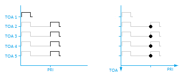
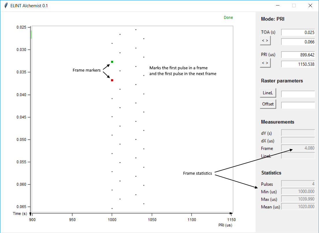
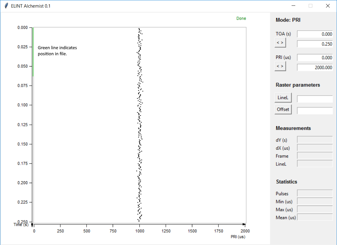
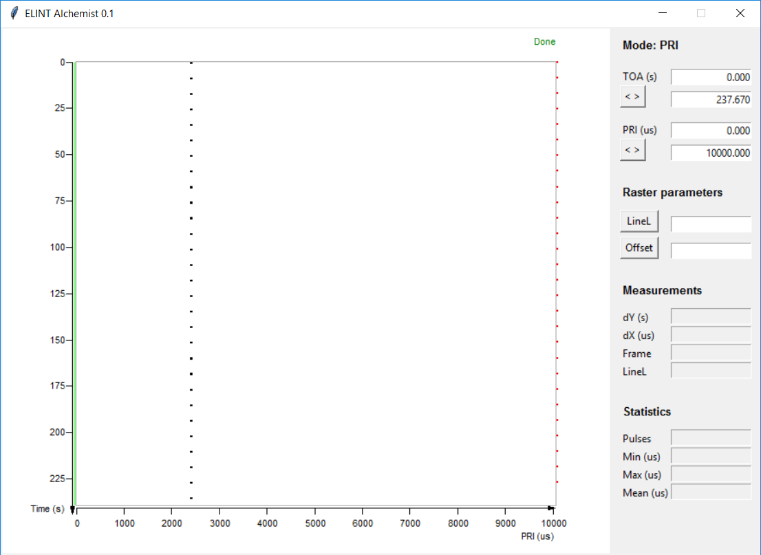
This is the basic plot type which reveals the character of the radar in a graphic and easily understood way. See the examples below:
- staggered PRF, four PRIs in four positions
- constant unstable PRF
- unstable PRF with scan
Raster plot
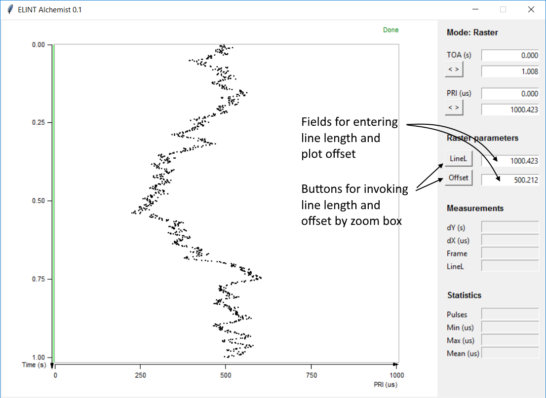
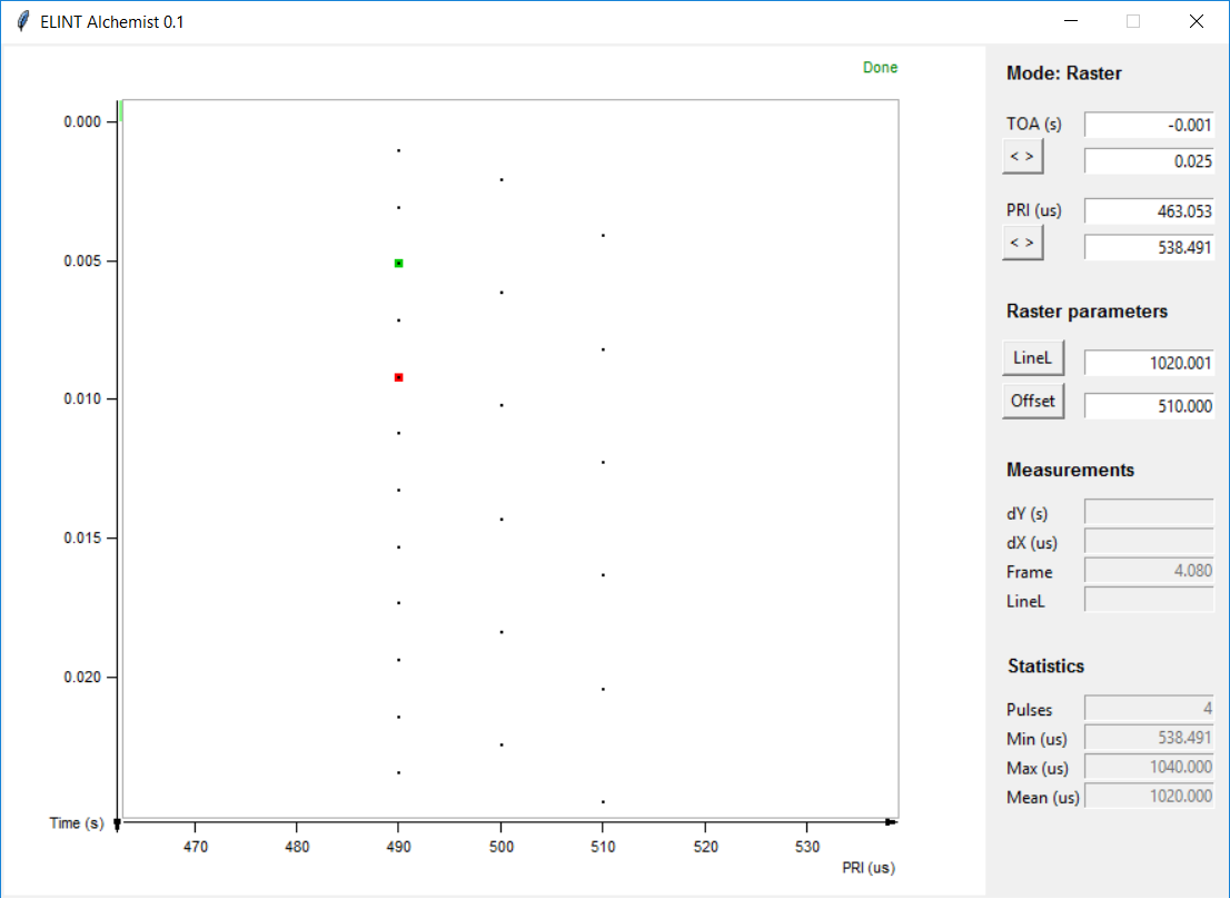
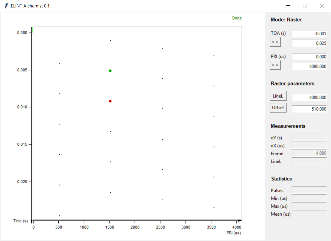
In a raster plot the PRF is compared to a reference frequency, much the same as in a Lissajous figure. But in the plot we compare the PRI to the reference frequency's period.
You can picture it as an oscilloscope trace which is triggered with a fixed frequency, and displaying the amplitude of the signal. Then you move the trace vertically so the traces won't overlap eachother.

If the PRI is greater than the reference time, the pulse position between consecutive traces will reflect that difference. This difference may be small between consecutive traces but the effect is cumulative and will be apparent over many traces.
In the left image below the PRI is greater than the reference time which manifests itself as a slight shift of consecutive pulses to the right, when consecutive traces are below each other. In the right image the PRI is even greater than the reference time resulting in a greater shift of consecutive pulses.

As with PRI plot, the pulses are most often plotted as points. See the examples below:
- constant unstable PRF
- staggered PRF, four PRIs in four positions
- staggered PRF, four PRIs in four positions plotted against four times the PRI
Histogram
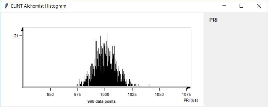
A histogram where you can choose to plot any TBD parameter; PRI, PL, RF etc. Currently only PRI is supported.
List
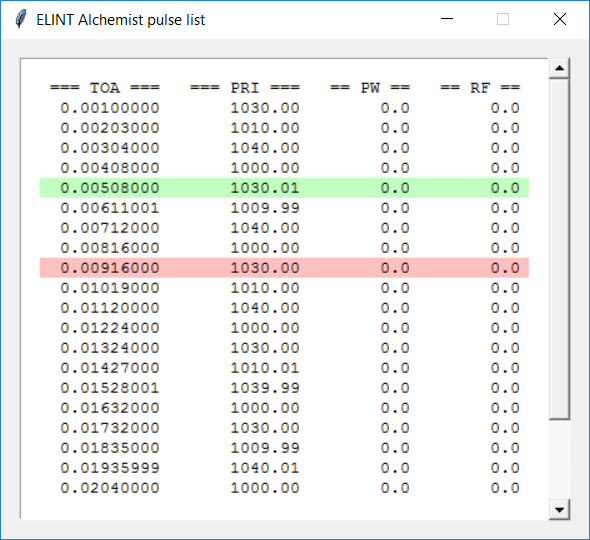
Not actually a plot, but a list of consecutive PRIs or delta-TOA if the list is called from Raster mode. Frame markers are indicated in the list.
2018-05-23
